
In this story
“Find your undertone” is popular foundation advice because it is memorable. It is also incomplete. A convincing match depends on several color dimensions, the formula’s finish, where you place the product, and what happens after it dries. Someone can identify as warm and still find most warm-labeled shades too yellow, too saturated, too deep, or simply wrong once the formula sets.
A better process treats shade matching as observation rather than a personality quiz.
Separate depth, hue, and saturation
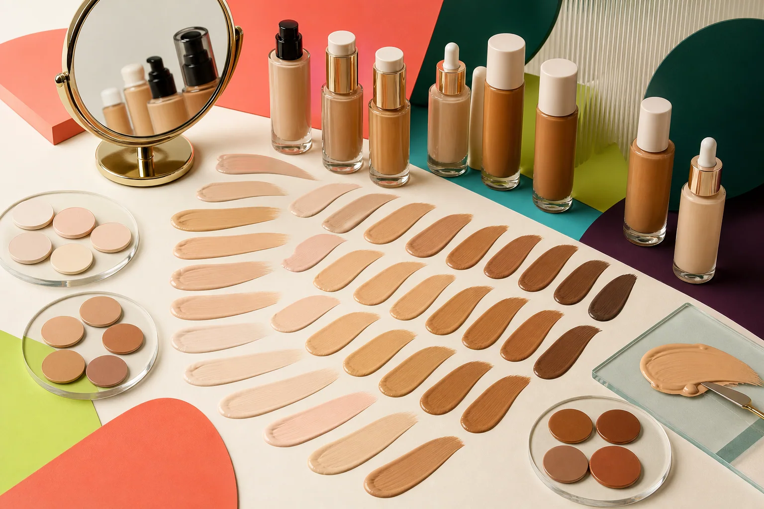
Depth is how light or deep the shade appears. Hue, often called undertone in beauty retail, describes whether the color leans more golden, peach, pink, red, olive, or relatively balanced. Saturation describes how vivid or muted that color is.
Saturation is the frequently missed variable. A foundation may have the right golden direction but look conspicuously orange because it is more saturated than your complexion. An olive-leaning complexion may need a muted green-gold balance that “warm” labels do not capture. A shade called neutral can still lean peach or appear gray depending on its pigment balance and your skin.
Brand labels are useful navigation aids, not standards shared across the industry. Treat the words on the bottle as a starting hypothesis.
Choose the area you want to harmonize
Faces are not one uniform color. The center can show more redness, the forehead can be deeper, and the jaw may differ from the neck or chest. Decide what you want the foundation to connect.
For a full-face base, test a narrow stripe from the lower cheek across the jaw so you can see the face, jaw, and neck together. If your neck is much lighter because it receives less sun, matching it exactly may make the face look disconnected from the chest. The goal is usually visual harmony across the areas that will be visible, not erasing every natural variation.
Do not use the wrist as the only reference. It is convenient, but its color, texture, and sun exposure often differ from the face. A wrist swatch can eliminate obviously wrong options; it rarely confirms a final match.
Let the formula finish changing
Compare shades at application and again after the formula has fully set. Some complexion products deepen, become warmer, or lose brightness as water and volatile ingredients evaporate and the pigment film settles. People often call every change “oxidation,” but drying, oil interaction, and sheer-to-opaque application can all affect what you see.
Apply candidate shades at the coverage level you would actually wear. A thick, unblended stripe can look different from a thin layer across the face. Keep the size and thickness of each stripe similar so the comparison remains useful.
Wait the same amount of time for every candidate, then view them in:
- indirect daylight near a window;
- the indoor light where you normally get ready;
- a quick phone photo with filters and portrait effects turned off.
Phone cameras adjust exposure and white balance, so photographs are supporting evidence, not a colorimeter. If the camera makes every shade look cooler or brighter, trust the live comparison.
Account for finish and coverage
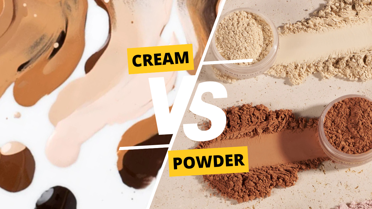
Finish changes perceived color. A dewy formula reflects more light and can appear brighter; a very matte formula may look flatter or slightly deeper. Sheer coverage allows more of your own complexion to influence the final result, while opaque coverage makes a small mismatch more visible.
That is why transferring a shade number between formulas—even within one brand—can fail. A “5N” skin tint and a “5N” full-coverage foundation may use different pigment loads, undertone balances, and naming systems.
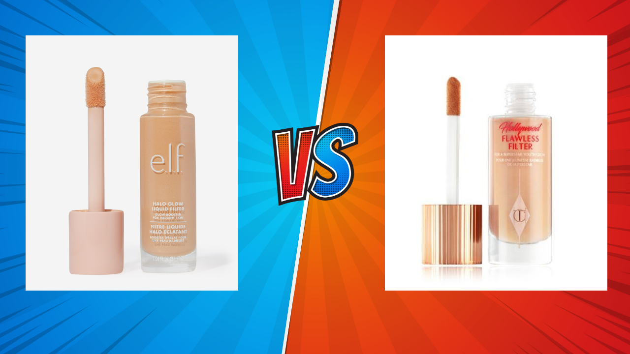
If you are comparing a possible dupe, match the final worn effect rather than the wet swatch alone. The closest pigment stripe is not always the closest finished face.
Use elimination before perfection
Start with three candidates around the likely depth: one slightly lighter, one near your estimate, and one slightly deeper. If possible, vary undertone within that range. Eliminate shades that create a clear edge at the jaw after setting.
Then compare the remaining candidates for a half day. Look at the mouth, nose, and hairline, where texture and color shifts often become more visible. Notice whether the shade needs extensive bronzer or concealer correction to feel wearable. Makeup can intentionally sculpt and adjust a base, but a match that requires rescuing every time may not be the most practical purchase.
Seasonal change is normal. If your complexion shifts meaningfully across the year, one bottle may not cover every month. A second shade or a mixing pigment can be economical, but mixing also changes the formula’s finish and wear. Test the combination rather than assuming only the color will change.
Know what a shade tool can and cannot do
Digital matching can narrow a large catalog, especially when it uses a known shade you already wear. Results still depend on current product data, image quality, lighting, and whether two brand shade systems map cleanly. A recommendation is a shortlist, not a guarantee.
Swatch databases have similar limits: different photographers, batch variation, monitor settings, and application thickness all affect appearance. Use multiple signals—known matches, live swatches, consistent photos, and return-policy awareness—when the purchase is expensive or hard to return.
Make the final call in ordinary life
The best shade is not always the invisible stripe under perfect store lights. It is the one that looks coherent at your normal coverage, in your usual environments, after the formula has settled. Record the exact product and shade, when you tested it, and whether it matched at your current depth.
Undertone still matters. It simply works better as one coordinate in a fuller map. When depth, hue, saturation, finish, and context all enter the decision, shade matching becomes less mysterious—and far more repeatable.
Turn the framework into a smarter product shortlist.
Use Dupes to compare products, inspect possible matches, and save the options worth revisiting.
Download on the App Store